What Are Statistics ?

Statistics are collections of data, often presented in the form of a table or a chart. When you write about a topic you may want to support your arguments or improve your work by referring to statistical facts, because that will make them more trustworthy (and, frankly, make your work look a whole lot cooler!). That involves doing several things: You must find the statistics, understand and evaluate them, and finally use them directly or through citation. This article takes you through those steps and provides you with some useful vocabulary in the process.
Finding Data
There are several sources for reliable data, some of them are listed at the bottom of this page.
In addition, newspapers will frequently include or refer to statistics in articles. You may of course refer to the newspaper, but generally the best idea is to look up the source itself to check if the numbers are correct. It will look more convincing to the reader, and you avoid building your arguments on false data.The key is finding a trustworthy source for your numbers and statistics rather than grabbing information off the Internet and taking it at face value.
Understanding and Evaluating

Once you have found the data you want to use, you must try to determine if those data are relevant and reliable, i.e. if they are useful for your purpose and if they can be trusted. That means that you must understand some basics about the collection and representation of data. This is actually a rather complex process, so here you will only get a very brief introduction.
In principle, data is gathered by collecting information from available sources either by asking people (e.g. questonnaires, interviews or polls) or by finding numbers that are registered by the government or private businesses (information about births, number of people collecting social security benefits, people's salaries, etc.).
It is important to distinguish between subjective and objective data. Subjective data (the kind collected by asking people) is more likely to be biased, i.e. to be influenced by personal opinion, because of the way people answer or the way answers are interpreted by the researcher. This is why there is a whole science behind this kind of data collection, and that statistics based on such data are often debated or criticized.
Objective data might of course also be interpreted with a bias, and there could be errors in the systems that collect the data, but generally they are more trustworthy than subjective data. This is something you should keep in mind and consider when you have found an interesting statistic. In a footnote, you may want to give your opinion about the data or the source of the data, maybe something like this: "This table was found on the gapminder website, which is generally considered a reliable and unbiased source. It consists of data collected from the countries' official national statistics."
One illustrating example of bias is if the researcher hand-picks the people to be included in a study instead of using a random selection of people, then there´s a good chance the results will not be trustworthy. Let´s say you wanted to check how many percent of Norway´s population are on Facebook and decided to find out by asking all the students at your school, you would probably end up between 90 and 100%. Those data would be biased if you used them about the population in general because your selection of respondents is not representative.
Using Statistics
When you have found and made sense of your data, you probably want to include your findings in your work. One option is to express the data in writing, another to include a visual representation of them. You may want to know a couple of things about the various alternatives.
Writing
Sometimes it could be the best choice not to include the statistic at all, but simply mention it as further proof of your statements. This can be done in a number of ways:
According to the DHS, 49% of all refugees and asylum-seekers come from Asia or Europe (http://www.dhs.gov/files/statistics/publications/yearbook.shtm).
The Indian Ministry of Statistics reports that the literacy rate among Indians rose by 13 percentage points from 52% in 1991 to 65% in 2001. That equals a 25% increase. (http://mospi.nic.in/Mospi_New/upload/statistical_year_book_2011/SECTOR-5-SOCIAL%20SECTOR/CH-29-EDUCATION/Table-29.6.xls)
The Pew Research Center’s Internet & American Life Project asked those in a survey how they preferred to be contacted on their cell phone and 31% said they preferred texts to talking on the phone, while 53% said they preferred a voice call to a text message. (http://pewinternet.org/Reports/2011/Cell-Phone-Texting-2011/Summary-of-Findings.aspx)
It is important that you remember to mention where you got your information. However, the complete links to the actual reports or statistics may of course be placed in a footnote or a list of references at the end of your text.
Graphic Representation

There are many different types to choose between. The following are perhaps the mot common ones.
Table
A table is a means of arranging data in rows and columns. The table normally shows the raw information in numbers, leaving it to the reader to find out how to interpret the data.
Chart
Charts are often used to ease understanding of large quantities of data and the relationship between different parts of the data. Charts can usually be read more quickly than the raw data that they are produced from.
Pie Chart/Sector Diagram
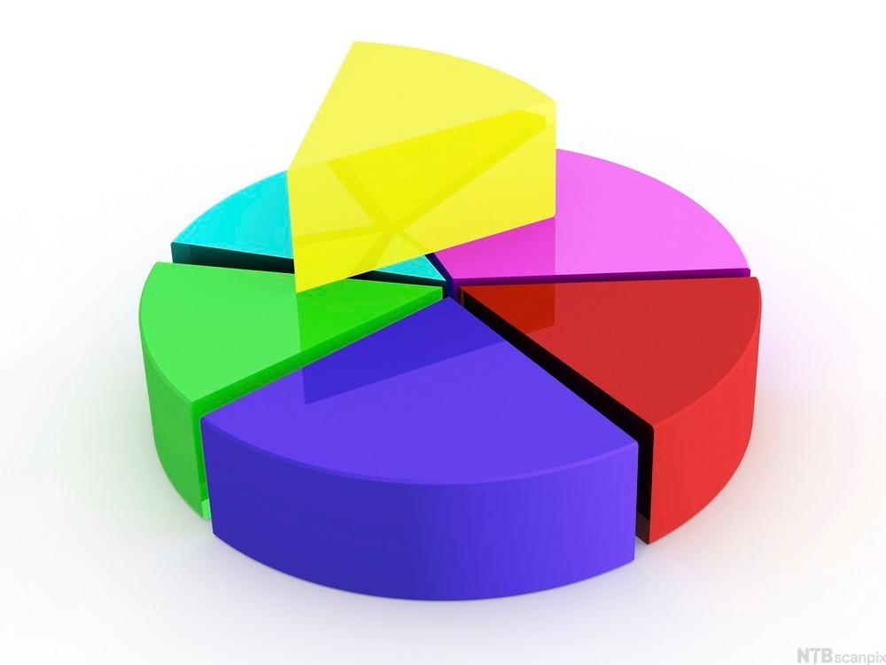
The pie chart looks like – well – a pie that is cut in different size slices depending on the data. For example, 50% equals half the pie. The pie chart or sector diagram is often used to visualize how large different factors in a statistic are in relation to each other. (illustration above)
Bar Chart
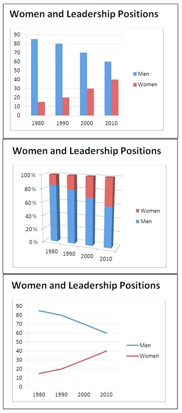
If you want to compare the number of various categories on a scale, the bar chart may be your best option. The bar chart has data put into bars and the length of the bar is decided by the data. (illustration above)
Line Chart
A line chart is often used to visualize a trend in data over intervals of time and the line is often drawn chronologically. (illustration above)
One final important point: Never use statistical data (or other sources for that matter) without commenting them. Graphs, tables or references that are included in a text without further mention are only acceptable in a few cases, normally when the text you write is informal. Using graphs merely as illustrations assuming they speak for themselves is never a good idea.
Summary
- Find relevant information/data from a trustworthy source.
- Make sure you have understood what the data say, to determine if you can use them the way you intended.
- Include the data in your work in a suitable format.
- Make appropriate comments/analyses of them.
- Remember show where you found the data in a way that enables the reader to go back to the original data and check if you have used them correctly.
Sources for Reliable Data
Statistics NorwayUK National Statistics
Office for National Statistics
US Census Bureau
India Statistics
Official India Statistics
Statistics Canada